
We’ve always been fascinated at how a few simple tweaks in composition can make such a difference in how your designs look and perform — transforming a piece that was just “passable” to great. So this week, we’re giving a warm welcome to spacing and alignment, the dynamic duo of composition. When applied to your work, these two principles guide designers to make small refinements that bring subtle — but important — order and balance to a piece.
Introducing Spacing
Spacing refers to the distance between design elements. When we talk about spacing, we’re referring to the amount of breathing room in a piece. Good spacing gives each element its own little space to shine. Spacing can also establish a clear sense of hierarchy, making certain elements “pop” while others gracefully fall back.
Spacing is as much an art as it is a science. Spacing is calculated in picas, pixels, or maybe even inches, but it’s up to the designer to decide what makes logical and visual sense for each project. It requires a discerning eye, but also, the ability to think creatively about the weight given to different objects on the page through negative space.
It’s also important to use spacing as a way to deliberately group related elements together. By strategically placing connected elements — for example, a photo, descriptive copy, and a call-to-action (CTA) — in close proximity, viewers can quickly grasp the intended meaning, even while skimming the page. Moreover, establishing consistent spacing conventions throughout a longer piece helps create a natural rhythm, guiding viewers to intuitively recognize which items are intended to be grouped together.
Here are some of our favorite tips when working with spacing within a design:
Give Elements Room to Breathe: Avoid overcrowding your design. Provide ample spacing around each element to give a sense of individuality and prevent visual clutter. White space, or negative space, plays a crucial role in creating a clean and sophisticated design.
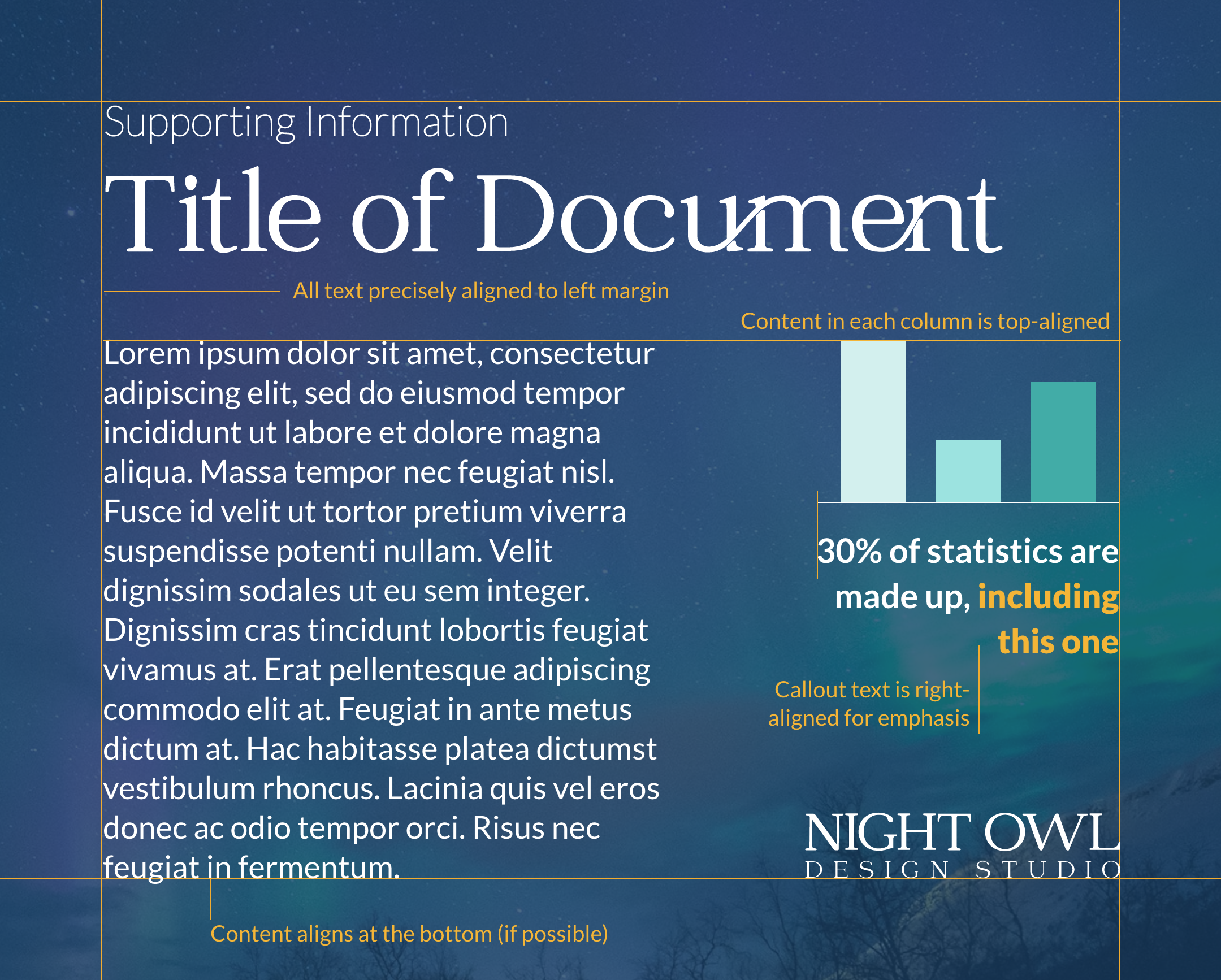
Mind the Margins: At NODS, we love our clean and equal margins! Pay attention to the spacing between your elements and the edges of the design canvas. Ensure there is sufficient margin or padding around the elements to prevent elements from appearing cramped or cut-off.
Emphasize through spacing: Use spacing strategically to highlight important elements or create visual emphasis. Increase the spacing around key elements, such as headlines or focal points, to draw attention.

Introducing Alignment
Alignment goes hand in hand with spacing — both principles create small changes that lead to visual cohesion. Alignment refers to the intentional arrangement and positioning of elements in relation to one another. In simple words: do the edges line up?
Spotting alignment issues comes naturally, even to the average non-designer. It’s remarkable how our eyes can sense when something is off in a design, even if it’s just a few pixels misaligned! In many ways, alignment is akin to good writing. When alignment is done right, it seamlessly blends into the background and goes unnoticed by the viewer, much like well-crafted writing that flows effortlessly and doesn’t distract the reader.
Here are some ways to think about alignment in your work:
Alignment for Emphasis: By aligning key elements differently, such as aligning a headline and body text to the left while aligning call out text in a column to the right, you can emphasize important information and guide the viewer’s attention.
Using Built-In Alignment Tools: Most graphic design programs offer built-in tools that make it a breeze to achieve precise alignment. With just a few clicks, you can ensure your elements are pixel-perfect and visually aligned without relying solely on rulers or your own eyes.
Grid-based Alignment: Grid systems provide a framework for aligning elements based on intersecting horizontal and vertical lines. By following a grid structure, designers can achieve precise alignment, create visual order, and establish a harmonious composition.
Final Words
In an ideal world, we would start every project with clear spacing rules, an alignment grid, and a consistency plan. But with quick-turn deadlines, big project loads, and work that draws us in fifty different directions, we understand that it doesn’t always work out that way.
However, we strongly urge designers to incorporate spacing and alignment as an essential step in their “final check” before delivering a design. You might have poured your creative energy into crafting a breathtaking and distinctive piece, only to realize that there are inconsistencies in the spacing, with two picas between one section and four picas between the next. Making that small tweak to equalize the spacing can make all the difference.