
Remember the graph paper you might have used in geometry class in school? That’s a grid in its simplest form. In graphic design, a grid consists of columns, margins, and gutters. Each works to create structure for a document and provides a foundation for creating visual consistency. If you’ve admired a designed piece and felt it had good flow, chances are that behind the scenes, a graphic designer used a grid to align elements in a way that pleases the eye.
There are three main components that help to create balance in grids:
Columns: These are the vertical sections that divide your layout. Websites often use two or three columns, while magazines might use more for their content-heavy pages. In a three column design, you can create an asymmetrical look by spanning half of the content across one column and the other half over two columns (see the example below).
Margins: Margins are the space around the edges of your design that act as a “frame.” Margins are important to ensure breathability in the design, but more importantly, they create consistency. For instance, it typically looks more balanced when the first item on the page is an equal amount of distance from the top as the last item is from the bottom.

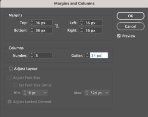
Gutters/Alleys: A quick clarification on graphic design vocabulary: Alleys are the space, or breathing room, in-between each column. The term gutter — which you might have heard more commonly — refers to the space in-between content frames on two-page spread (think, where the magazine folds). However, gutter is colloquially used by many designers to describe the space in-between columns, perhaps because even Adobe InDesign has the word gutter in their “Margins and Columns” menu!
Having ample space between columns helps to differentiate content sections and improve readability. Generally, brands will decide on a default spacing for gutters and alleys to keep documents consistent. Alleys are typically used as vertical markers, but can also inform how you space elements horizontally from one another. For instance, if your spacing is 40px between columns, you might use 20px of space between content sections within your columns.
Why Use Grids?
We like to think of graphic design like a puzzle. As a designer, you’re handed all of the different pieces of the puzzle — text, images, headlines, CTAs, etc — and asked to arrange them aesthetically on a page. Over time, your eye might develop to naturally create intuitive balance (do you ever just know when things are 1-2px off balance?). But even so, using grids offers several benefits for designers:
Organization: Grids not only prevent your design from looking cluttered or chaotic, but they create “rules” for you to follow between projects. This is particularly useful if you work on a larger design team, so a teammate can pick up your work or create work on their own that looks consistent to the brand.
Efficiency: Grids save time and effort by establishing a clear structure from the outset. Graphic designers are working on arranging puzzle pieces, but the less decision-making we have to do, the more we can focus on being creative in the way we lay out these pieces. Grids create the structure so we can focus on the more interesting design decisions.
Readability: Users like layouts that feel clear and organized, as it tells their eye where to look and the weight to assign to each piece of the puzzle. When pages all follow a consistent layout, users are able to absorb the content quicker and with more ease.
Grids are a fundamental tool in every graphic designer’s arsenal. They provide structure, organization, and clarity, ultimately enhancing the visual impact and user experience of the final product. So, next time you admire a well-designed website or poster, take a moment to appreciate the invisible grid working behind the scenes.