
Think about your favorite meal. Maybe you’re imagining of a perfectly cooked steak with a side of mashed potatoes. Now imagine the chef heated it and placed it on your plate — sans any seasonings or spices. Pretty bland, right?
Here at NODS, we like to think of color as our seasoning. Similar to how a chef uses spices to add flavor to their dishes, graphic designers use color to add life to their work. When used well, color can make a piece more engaging and memorable.
Emotional Impact
Imagine a company that sells massage oils, lotions, and aromatherapy treatments. Take a minute and imagine what their print materials would look like. What did you think of, what colors did you see in your mind? Was their logo a calm and relaxing green, or a tranquil blue, or pure and clean white?
Colors have the power to evoke different emotions in people. Red is often associated with excitement, passion, and danger while blue is associated with trust, calmness, and intelligence. When considering your audience, consider which colors are they most likely to respond to, and consider the goals of your piece. Using this framework, designers can craft their work to evoke the desired emotional response in viewers.
Readability
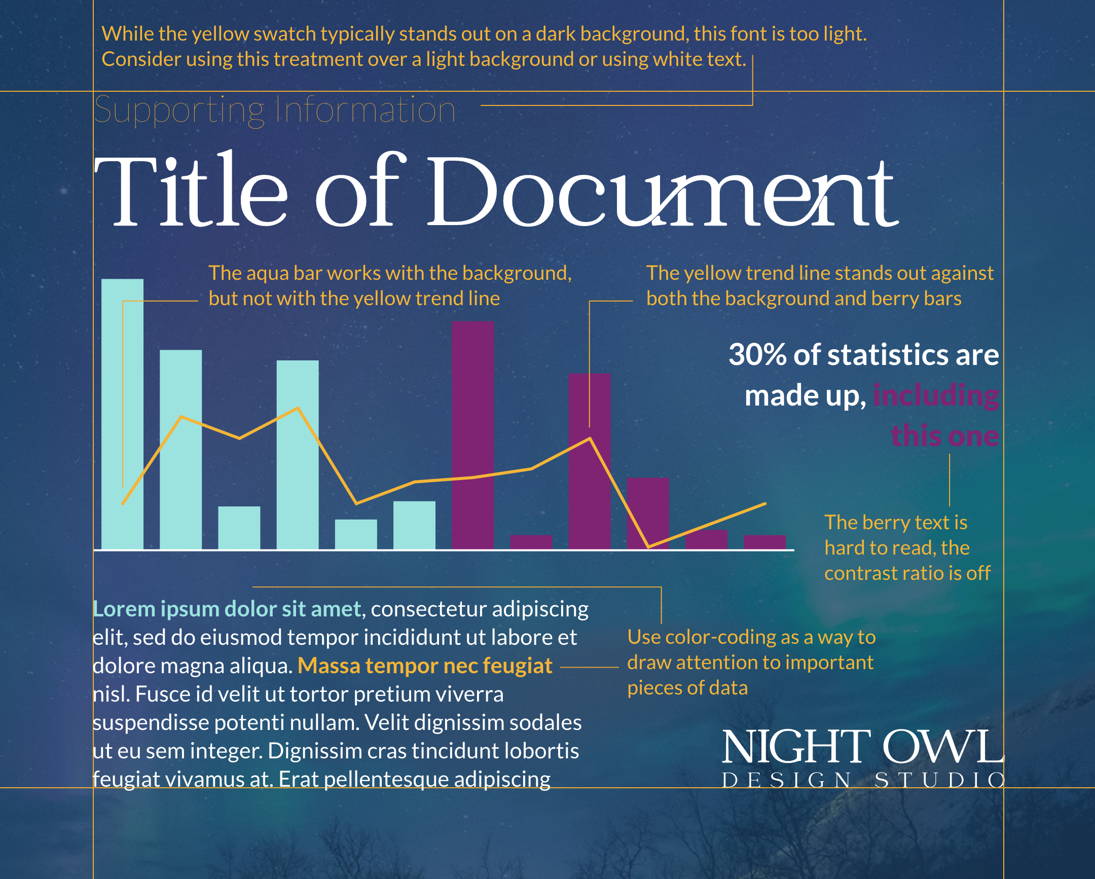
Have you ever looked at a piece and thought, “What am I supposed to be looking at, here?” As designers, we have lots of tools to draw our viewer’s eye to where we want them to look, but color is one of the most powerful. Color can also affect the readability of a design, especially when it comes to complex charts and graphs — which is particularly pertinent in financial design.
For example, a designer might use a darker color to highlight a data trend line against a light background. Or, they might use a brighter, more saturated color to highlight a callout data point. Small changes like these help to improve reader understanding and comprehension.
Contrast & Emphasis
Picking contrasting colors can make a design more interesting and help organize information. For example, a designer might use a brightly colored button against a plain background to make it stand out. Or, perhaps they might also use a darker color for the most important text and a lighter color for secondary eyebrow text information. Sometimes it takes finagling and comparison to see exactly what works best to create the most visual “oomph,” but the effort is well worth it!
Color isn’t only about pizzazz and style — it’s about readability and accessibility. People with visual impairments may have difficulty reading text or distinguishing between elements in a design if there is not enough color contrast. A website with black text on a white background is easier to read than a website with a more homogeneous color scheme; for instance, gray text on a lighter gray background. The higher the contrast ratio, the easier for your viewer to read your content.
There are many contrast ratio checkers online — use these resources to be sure that your color selections pass accessibility standards.
Final Words
Color is a powerful tool. It’s the secret spice in your design arsenal that can be used to create work that is visually appealing, and accessible. By understanding how color works and using it strategically, graphic designers can create designs that evoke emotions, tell stories, and leave a lasting impression on the viewer.