
With ever-changing trends and increasingly-short viewer attention spans, creating visually impactful work is so important. Whether you’re running a business, creating a marketing campaign, or simply trying to get your message out there, the way you present your information is crucial to its success. That’s where the graphic design comes in. By understanding bread and butter key principles — such as balance, contrast, spacing, color, and typography — you can create timeless work that is visually appealing, clear, and effective.
In this series of blog posts, we’ll explore design principles and show you how they can help you take your communication to the next level. In this first post, we’ll be diving into balance, and how it can help you improve your designs.
Introducing Balance
You know how when you know, you know? Balance is the intangible element that makes a design feel “right.” It creates visual stability and harmony between the elements on the page, ensuring that they are distributed in a way that feels equitable in weight and importance. Balanced pieces have a sense of flow that guides the viewer’s eyes to the key elements and presents information in a clear and easy-to-understand way. In financial design, where clarity and professionalism are critical, balance is a great way to convey trust and reliability.
Types of Balance
Symmetrical balance is achieved when the visual weight of elements on both sides of an imaginary axis is equal. This type of balance is often used in logos and other designs where a sense of stability is desired. To create symmetrical balance, simply divide your design in half (or quarters) and make sure that the visual weight of the elements on each side is equal. This symmetry is often achieved literally through mirrored objects or elements, but it can be more abstract — you could mix and match two equally sized but different images, blocks of text, or graphic elements.

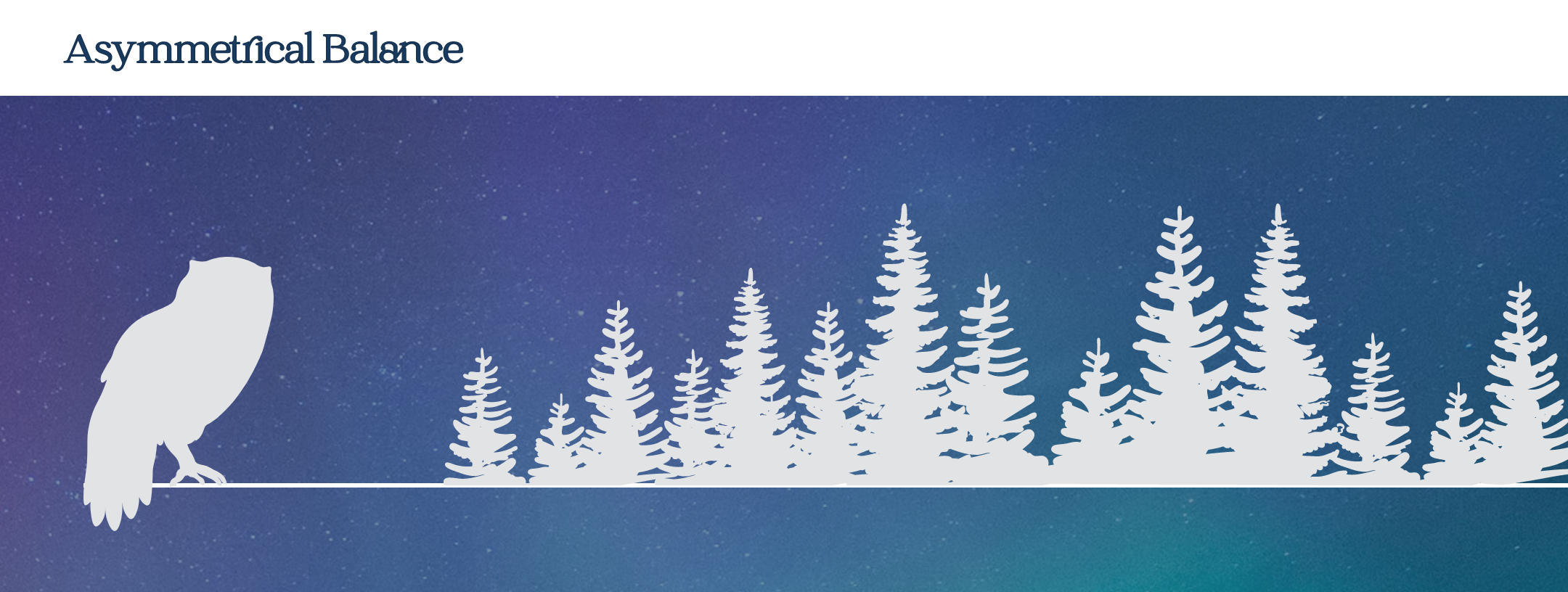
Asymmetrical balance is achieved when the visual weight of elements on either side of an imaginary axis is unequal, but the overall composition still feels balanced. This type of balance is often used in designs where a sense of movement or dynamism is desired. To create asymmetrical balance, you can use elements of different sizes, shapes, and colors. For example, you could use a large image on one side of your design and a small image on the other side, or you could use a bright color on one side and a muted color on the other.
Radial balance is achieved when elements radiate out from a central point. This type of balance is often used in designs where a sense of focus or emphasis is desired. To create radial balance, simply arrange your elements around a central point. Radial balance can be used in advertising to guide the viewer’s eye to a CTA or other important information.

Additional Tips
It’s not just about the size of elements — color, texture, and space can also contribute to the balance of a piece. For example, you could use a light color on one side of your design and a dark color on the other side to direct attention and create visual asymmetry. You can also use space to create a sense of balance by leaving negative space around important elements — allowing the piece to “breathe.”
Experiment with different layouts and compositions until you find one that works well for your design. Design is like a puzzle — you’re handed a list of different elements, and your job is to make the pieces fit together in a way that’s both aesthetically pleasing and easily understandable for the viewer. Fiddle with different combinations of elements and see what works best for your design; you may even be surprised with where you land. There is no right or wrong answer when it comes to balance, so don’t be afraid to experiment.